Colour is powerful.
Did you know that colour plays a significant role in how clients perceive you, your business, and your ability in serving them? You may think picking colours for your website or your brand is as simple as picking the tones and hues you personally love, but in reality all these choices have a big impact on how the average user will engage with you.
In a study by the Institute of Colour Research, it was determined people (clients) made a subconscious judgement within 90 seconds of seeing a product (i.e. brochures or apparel), social media pages, or website pages. This judgement was 62-90% based on colour alone!
Colour speaks loudly in branding .
If you are looking at your brand, no matter what size of operation you run, looking at colour psychology and using the information in selecting your colour profile is worth your time and ultimately one of the fundamental elements in a brand.
The simplest way to do this is by utilizing a mood board. Mood boards are fairly simple to create (I will walk you through this during the article) and you can find apps and websites that allow you to play around with it easily too. To break it down I will show you a few examples and the thought process behind them.
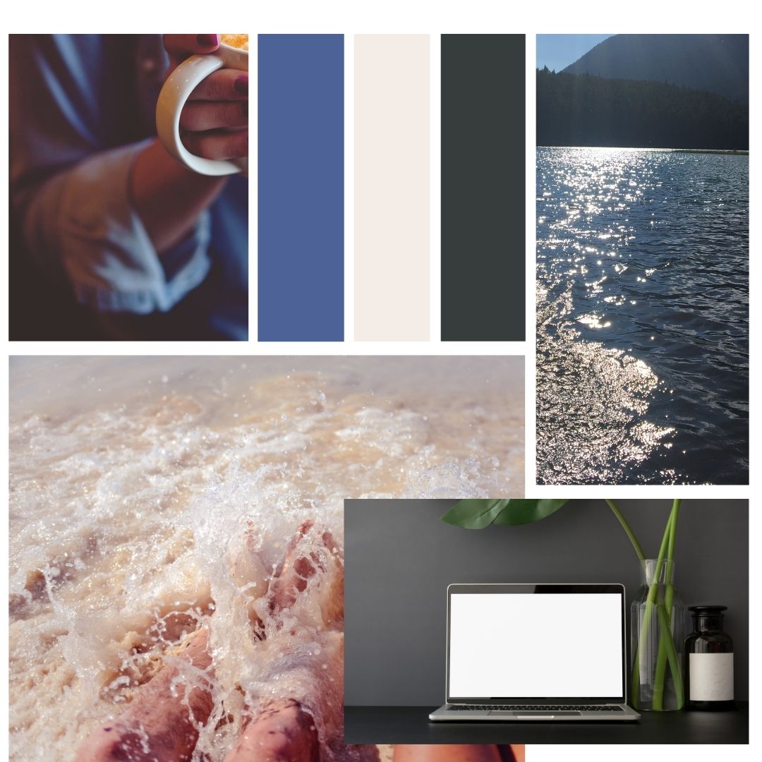
Let’s start with an example for a brand I just created - let’s say this is my personal brand as a freelance writer.

To create my mood board I chose three colours based on the known associations the average person makes when they see them, and I chose them to send a specific yet subconscious message about who I am and what I want clients to feel about me.
Once I compiled my mood board (I used a free app calledCanva), I would then purposefully use these colours in my website, social media posts, and in all documents I choose to compile for clients (i.e. newsletter, estimates, proposals, thank you cards).
So let's look at what the data shows about my colours:
Blue: This emotes a feeling of calm, confidence, dependability, professionalism, integrity. I went with a denim-blue, adding to a nostalgia most of us have about this staple piece in our wardrobes.
Brown: This may make you feel earthy, centred, and in a light hue such as this near-beige, it denotes a feeling of softness. It also represents neutrality, reliability and a feeling of being genuine/authentic.
Gray: This colour carries a feeling of distinction and elegance for most readers, but also adds a sense of formality, authority, and maturity. Gray is one of those magical colours that can be paired with almost any other colour.
Before we go on to the next step of walking through the process of creating your own colour scheme (or mood board), here is a look at what some of other colours can make an audience feel or associate with your profile. As you read through these, make a note of which three you feel sends the message you want to create with your audience.
Green: Soothing, peaceful, growth and life, money/success, and calming.
Purple: Protective, wise, imaginative, royal, luxury, and dignity.
Orange: Energetic, cheerful, warm, confident, and desire.
Yellow: Enlightening, friendly, clarity, optimistic, and a sense of abundance.
Red: Passionate, daring, urgent, youth, and excitement.
White: Hope, light, purity, simplicity, and coolness.
Pink: Sensitivity, faithfulness, romance, compassion, and beauty.
Black: Power, mystery, sophistication, and formality.
So now that we know what certain colours can make us think or feel and how that can impact a client's choice in reaching out to us, the only question remaining is how to create a mood board.
The first suggestion would be to hire a professional! There are many brand designers available, so feel free to spend time online looking through various portfolios. And if you think you may want to work with me, just send me a message.
When that fails due to budget (which happens, it’s okay), the basics is for you to decide what your business represents. Do you want your brand (business) to be: classic, spunky, retro, energetic, soothing, endearing, powerful, feminie, masculine, holistic or earthy for instance. Then look at the colour guide from above and pick the top colour for the number one message you want to send. For example, your priority is to be seen as "trustworthy".
Once you pick that one colour, you choose two or three others that will support the main feeling based on your next three feelings you want to denote. For example, you chose trustworthy, then added “cool” and “successful”. So your colours would fall in hues of blue, green and white.
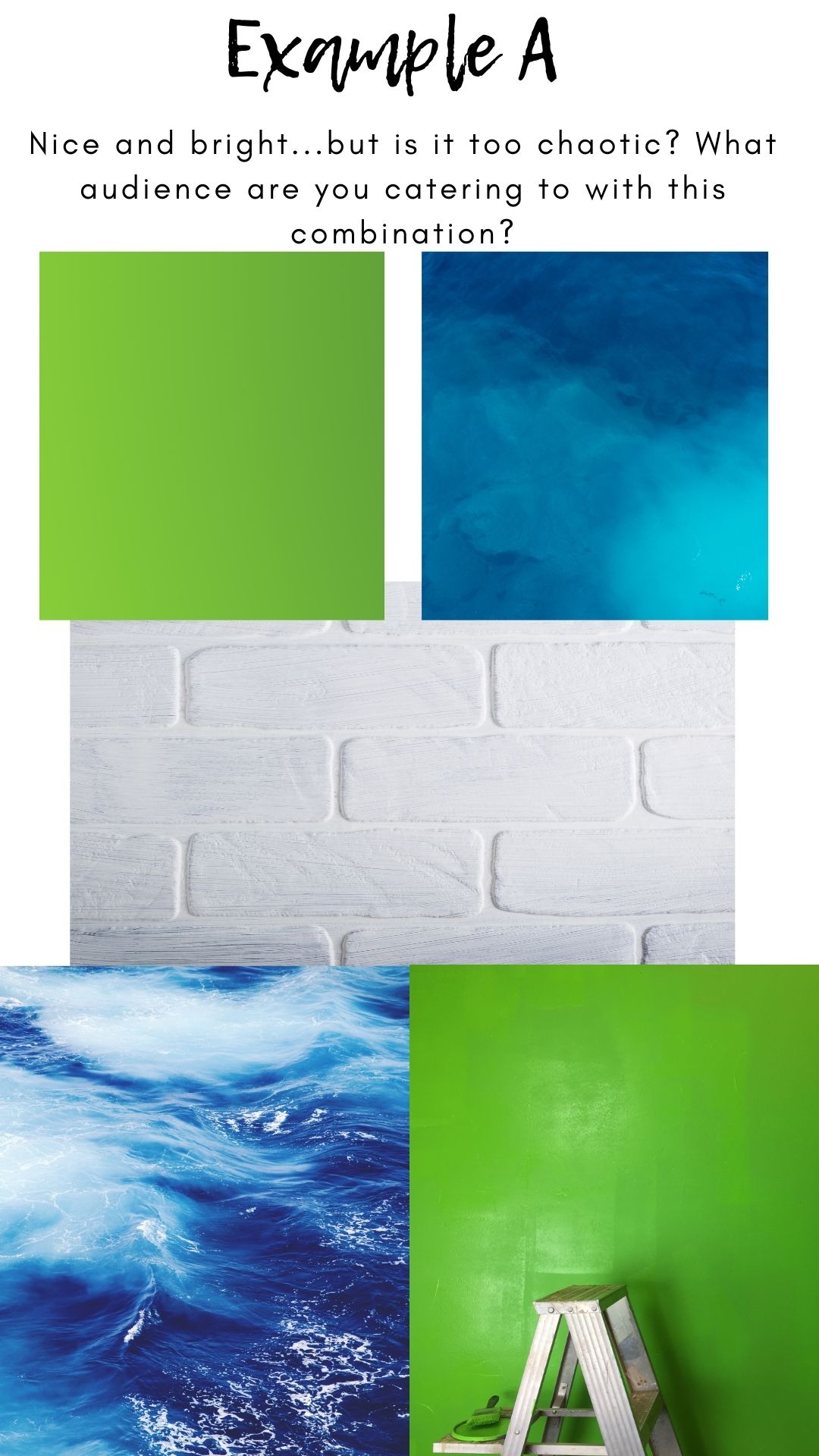
Once you have your main colours, you need to play around with the various hues to find a harmony. Simply throwing colours together can be disastrous if they make people squirm, so don’t be afraid to ask some friends or colleagues for input into a few examples you create. Certain harmonies also create different vibes - I will show you two examples using the same three colours we discussed here. Take a look at how these two may impact an audience.

In example A we are using all the right colours, and on certain products or for certain age groups this bold combination may work, but - are you selling to kids or to adults? My 10-year-old would love this combination, but as a 40-year-old it gives me a bit of a squirm. And imagine this as your website, would viewers take you as a professional and mature - or is it more youthful? Does the loud green outweigh the calm and cool of the white?
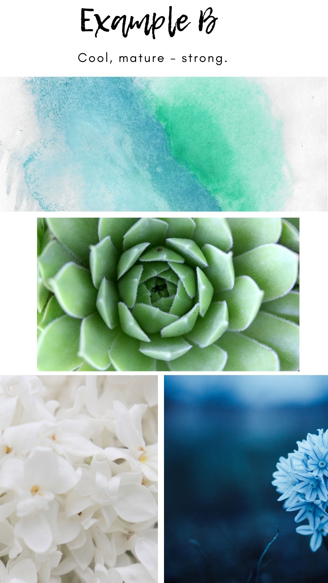
Now let's look at example B.

Same colour combinations, but with a much softer hue choice. Looking at this combination, my 40-year-old brain feels calm, neutral, healthy, and at peace. How about you?
As mentioned earlier, knowing your audience is a just as important when choosing your colours as is the colour choice itself. The colours that are aimed at a teenager, or a parent of a toddler looking for a product, or those aimed at a business will all be different. Always do your research in what kind of colours are getting positive feedback from the audience you are hoping to gain.
I hope this article will come in useful to you, and if you have any input or questions please drop me a comment. If you liked this article, share it with others.
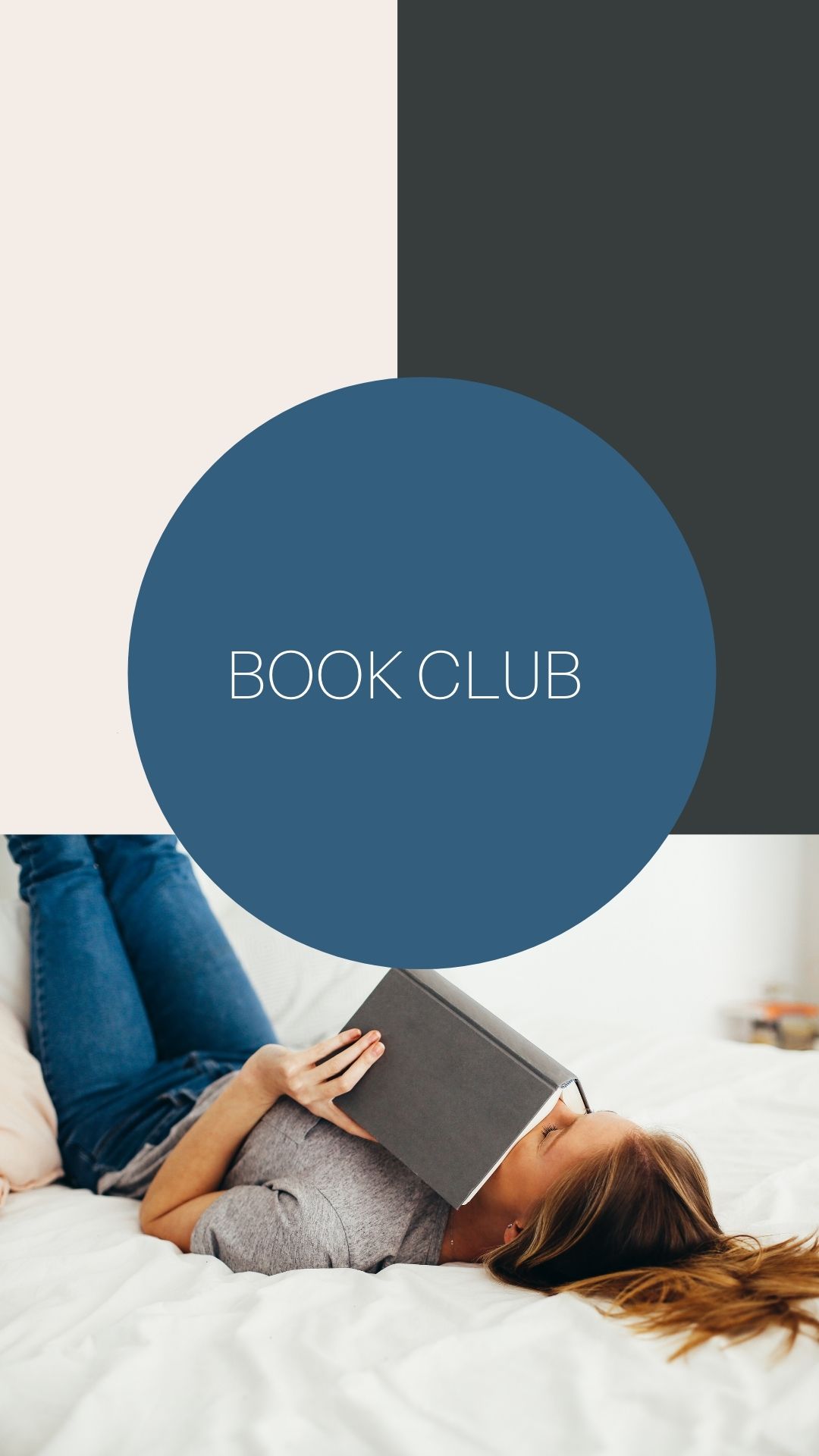
For fun, here are a few examples of how I could expand on my advertising or social media using the mood board example for my brand. You can also click on my CV and see how the colours were utilized there.


0 Comments Add a Comment?